
Expressing oneself though a web medium can be difficult. Mannerisms and interactions that distinguish people from one another are hard to abstract into the building blocks of websites in color and tyopgraphy. Consequently, many online portfolios on the web look extraordinarily similar: though each one is engineereed thoughtfully, the design presented on the surface may not reflect the creator.
Behind the design
My first attempt at a portfolio was dismal in this aspect: it looked like it had been made from a template. Thought it didn't look terrible, it didn't show identity. The first thing that went into crafting this portfolio was trying to inject identity: every design decision I made was deliberate in trying to demonstrate something. I created many prototypes in Figma, and eventually settled on a theme: the grid.
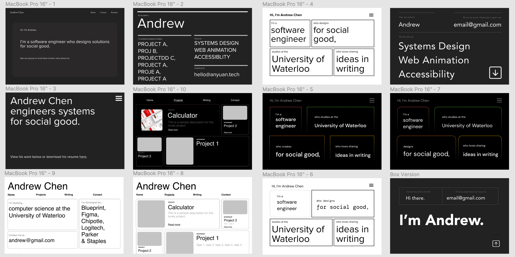 Rejected prototypes
When I was picking up graphic design, the first book I read was Müller-Brockmann's Grid Systems in Graphic Design. As somebody who'd struggled in art classes throughout elementary school, the structure and rigidity offered by the grid was ironically liberating. Being able to design within a set of rules that ensured visual harmony left me free to experiment with aspects other than layout.
Building the Site
To build the website, I chose to use Next.js. Since I wanted to try a React framework, I had three main options: create-react-app, Next.js, and Gatsby. Each one had a few advantages, but I eventually settled on Next.js because of it's inclusivity of strong server side rendering and static generations. During the process of bulding the website, I encountered two main issues: maintaining a design system statically generating pages from Markdown.
I experimented a lot with styled-components, even completing a version of the website purely with them. However, I eventually switched over to using material-ui's unstyled components for semantics reasons. With styled-components, I had text styles represented as components: tying the semantics to the style (eg. the h1 tag would always correspond to the h1 style).
   const header = styled.h1`
      ...styles
   `
   const header2 = styled.h2`
      ...styles
   `
   const header3 = styled.h3`
      ...styles
   `

   <div>
      <header></header>
      //where is the h2?
      <header3></header3>
   </div>
This often caused poor semantics in my pages, with sometimes there being an h2 tag on a higher level of visual hierarchy as a h1 tag, and sometimes even skipping from the h1 tag direclty down to the h5 tag. MUI offered a solution for this problem in the seperation of semantics and styling through the component tag.
//creates a h2 styled like a h1
<Typography variant="h1" component="h2" />
To render my markdown, I used the standard combination of remark/rehype, but with mdx-bundler instead of the default mdx renderer. mdx-bundler was chosen because of it's ability to import in individual files on a page by page basis- I no longer created a single monolithic bundle and pass it to the static generator for all of the pages. This improved the build and load times of my website hugely.
Through this process, I learned a lot about Javscript, CSS (pseudo elements, transitions, animations), and finicking with Figma. But most of all, I think it's a better representation of who I am - both as a designer and developer.