Though working with other developers may introduce small shifts in task management and the way Git is used, working with a designer shifts the paradigm.
When I was working as a solo developer/designer combo, I was able to design to the limitations of what I was able to do with CSS. I stuck to more conventional layouts that could easily be represented through flexbox and grid. This was my first project working with a designer, leading me to have to work around their needs and wants.
User Flows
One of the first differences I noticed in the way that the designer and I thought was in how we broke down the user experience on a page. Like most developers, I developed components, and rearranged those components to form pages. On the other hand, the designer I worked with thought in terms of user flow: much more focus was placed on their interactions and eye movement across the page.
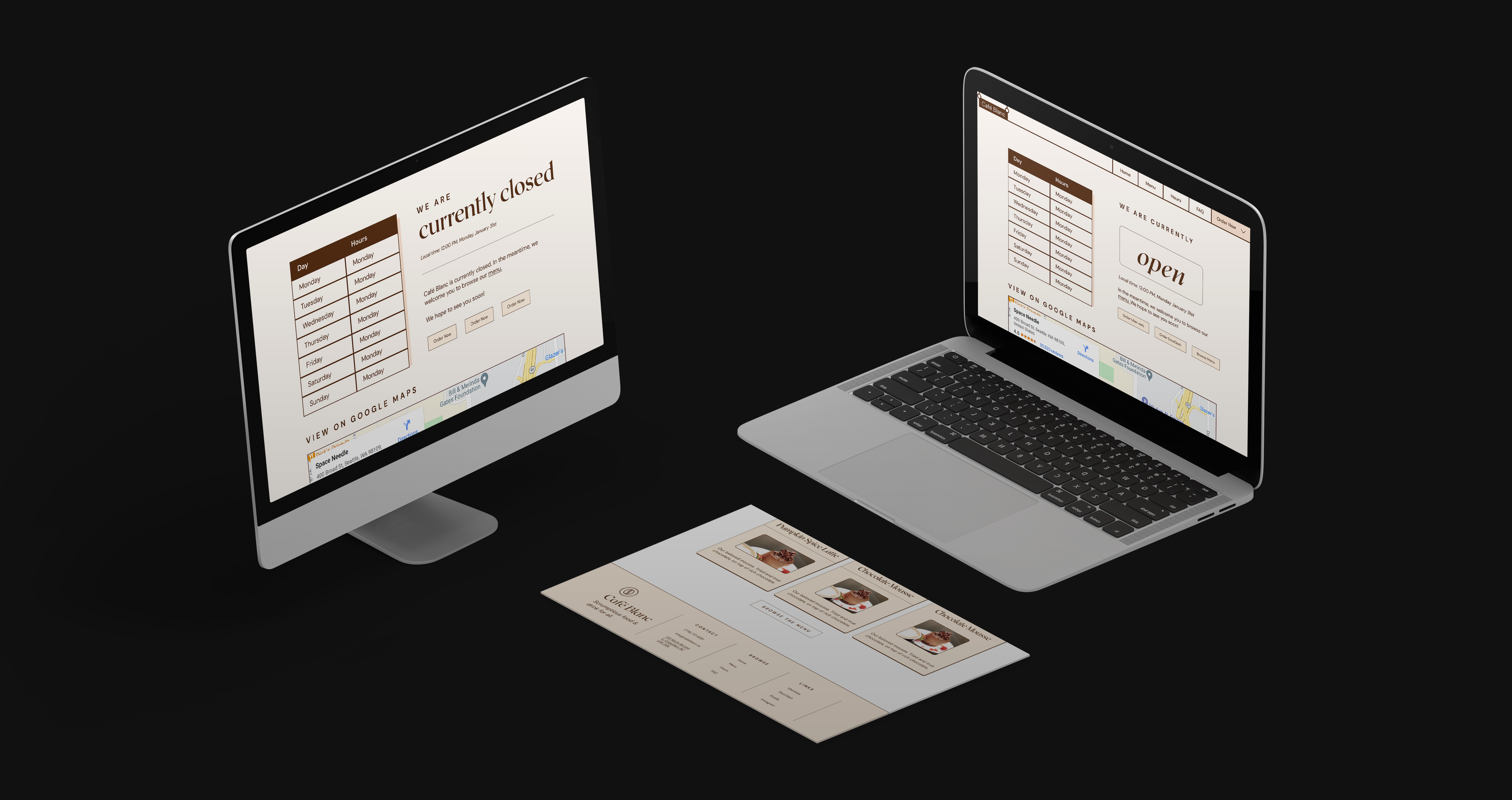
Through this, I realized the limitations of my view: it was an abstraction useful only for development itself, and often bottlenecked my creative design. In this project, one of the places where this was the case was the landing page.
Looking at this layout, the right side seems fairly difficult to lay out using flexbox and grid. The overlay of various elements over each other makes the usage of negative margins necessary, and also causes complications with the accessbility of the website. I couldn’t just exclude these little overlays either, for they added the charm that made the website so nice to use.
Building layouts like this forced to me to adapt CSS to business needs instead of finding comprimise that erred too hard on the side of the developer.
Representing Visual Space
As a web developer, my first instinct when trying to space something out is to set px values for every single padding until it "looks right". However, this comes with some downsides.
- Using px disrespects the user set font size, making it impossible for many vision impaired users to access the page.
- It's hard to keep the page cohesive, as padding/margin will likely be inconsistent across similar use causes
As my designer also used pixels, it was a fairly difficult transition into using more reponsive units. We settled on using rem, as it was consistent (HTML root element's font size), and also farily easy to convert into px. It also conincided well with the 16px grid that the designer was using - making it easy to just think of 1 rem as 1 grid length.
To keep our page cohesive, I took a more mathematical approach. I was inspired by this mathematical approach to spacing. By using powers of two, it was likely that things would naturally add up and form implicit rows and columns, making the entire page look nicer. I thus stuck to using rem units in the power of two, keeping spacing both consistent and responsive.
spacing: [0, "0.125rem", "0.25rem", "0.5rem", "1rem", "2rem", "4rem", "8rem"],
Though this project hasn't yet finished, I've already learned a lot, and am looking further in improving this site.